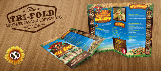
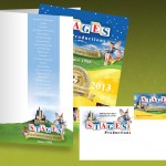
Tri Fold Brochure Design
Tri Fold Brochure Design and Copywriting Tips
A successful print marketing campaign depends on two crucial aspects: the design and the copywriting. These key components are woven together, one dependent on the other to the point it is nearly impossible to separate the two.
This unique relationship is most obvious in brochures. The strategic placement of elements and content can be tricky to master.
Why Tri Fold Brochures?
Without a doubt, tri fold brochures are the most popular layout style. These are a crowd favorite for one simple reason: they are effective. But there are certain challenges that come with designing tri fold brochures.
Because of their popularity, it is especially important to master the tri fold brochure design and writing essentials. Otherwise, your brochure will blend in with the others, indistinguishable from everyone else in your industry.
Plus, with all that space, it can be confusing to figure out what goes where. Which section is the best place to put your most important information?
Let’s look at some of the ways to make your tri fold brochure design as successful as possible.
 1. Pick Just One Purpose
If you don’t have a massive marketing budget, it can be tempting to create a “jack of all trades” brochure—something you can distribute to anyone in any situation.
Unfortunately, that isn’t the best tactic. You want to customize your content and design to reach your target audience. To do that, you’ll have to pick your purpose.
Will you be distributing this brochure at an expo? If so, the purpose might be to provide a general overview of your products, services and company. Since you’ll be meeting people face-to-face, you can communicate all the details they want.
Will you be distributing the brochure after a presentation? If so, the purpose would be to summarize the information that proceeded its distribution.
Will you be mailing this brochure to potential customers and clients, hoping to facilitate a purchase? If so, you’ll need plenty of creative sales copy.
Once you have your purpose, let it drive the tri fold brochure design and content.
2. Share Benefits Rather than Features
It is often tempting to list out all the bells and whistles of your products. You’ve worked hard to craft the ultimate experience for your clients and customers. You want them to know everything they have to look forward to.
But studies show people respond better to benefits rather than features. If you really feel the need to highlight the features, find a way to spin the benefits into the content.
For example, you might say something like…
- The passenger side air bags (feature) help ensure everyone in the car is safe (benefit).
- The blender’s five speeds (feature) make beverage preparation quick and easy (benefit).
- Our environmentally safe cleaning service (feature) means you won’t have to worry about toxic chemicals harming your children (benefit).
You’ll need to rely on the content of your brochure to do the talking. While you can write about the benefits, your tri fold brochure design elements will probably lean more towards features.
 3. Supply the Necessary Evidence
Most people need a little proof before they’ll believe marketing claims—especially if they are quite outstanding.
For example, some phrases and design elements are more compelling than others. “Contains 75% less fat than competing brands,” is more compelling than, “Our product helps you lose weight.”
If you don’t have stats or other documented proof, don’t worry; testimonials will be your saving grace. Ask trustworthy, influential, believable sources to provide feedback.
4. Set the Tone
The content and overall feel of your tri fold brochure design will say a lot about your company. Make sure you communicate in the most effective—yet appropriate—way to reach your target audience.
Is your company a little silly, obscure or otherwise untraditional? Let your tri fold brochure design convey that impression. Are the services you provide more serious and conventional? Bear that in mind as you sit down to write.
Getting the tone wrong in either the design elements or content could be disastrous. For example, you wouldn’t want light, carefree text alongside an obnoxious image on the brochure for a funeral home.
If you aren’t sure about the appropriate tone, just be legitimate, relatable and approachable.
5. Induce Action
One of the most important—and overlooked—aspect of a brochure is the call to action.
When properly executed, brochures do much more than just dispense information. They also convince the reader to take action—buy something, visit a location, sign up for a particular service.
Without a call to action, your tri fold brochure design is incomplete—and a total waste of time, effort, and resources. Tell readers exactly what you want them to do.
Remember, a call to action doesn’t need to be a bold, direct, or in-your-face statement. Subtlety is ok.
You don’t need to come out and say, “Buy our products.” You could say, “Visit our website for a complete listing of products and services.” To be even more effective, lead your call to action with a benefit: “To increase your productivity and mental clarity, check out the services available on our website.”
 6. Put it in the Right Place
Now, what you’ve all been waiting for—the tri fold brochure design tips that will ensure your message is well received.
Potential customers will never read your carefully crafted content if you can’t get them to even open the brochure. To increase the likelihood of content consumption, put everything in its proper place.
There are essentially six different places to put your content in a tri fold brochure.
The cover
This is, obviously, the most important piece of real estate. It is the first thing people will see. Put your most convincing and persuasive content on the front.
You’ll definitely want to put your company name or product information front and center. Pair that with a captivating image.
Most importantly, give a little preview of what readers can expect from the rest of the brochure. Share a benefit or two. This will encourage readers to go in search of the rest of the story.
The inside front panel
The next section readers will encounter is the inside front panel. The cover compelled the reader to take the next step. Use the inside front panel to keep the enthusiasm high.
In this section, share the most appealing benefits—the heart of your sales copy. Use all the persuasive writing skills you have. Add a few mouthwatering images and your tri fold brochure design is nearly complete!
The inside section
This is the largest section of the brochure. With all that space laid out before you, it is tempting to go overboard.
Remember, you are focusing on the benefits rather than the features. Your writing style should be to persuade rather than inform.
If you suspect some holdups—issues with the price, uncertainty over the technology—use this space to quell those fears and reassure the reader.
The back
This portion of the tri fold brochure has the least amount of exposure. As such, many people are tempted to do the bare minimum—slap the contact information on the back and call it a day.
In reality, this could be a great opportunity. Since the people most likely to see the back are the ones most interested in your message (evident by the fact they read your brochure cover to cover), use this space to offer a coupon or other incentive.
Are You Ready to Get Started?
Now that you have the general understanding of your tri fold brochure design and copywriting expectations, it is time to get started.
Check out some of our other valuable resources. We have a great blog article with brochure design tips that will help you craft your actual content. Information regarding innovative brochure design ideas will help get your creative juices flowing.
Since we all know it is essential to hire a professional brochure design company to handle important projects like this, give us a call today. Subtle Network will ensure your tri fold brochure design is cost-efficient, attractive and effective.

